#css background effects
Explore tagged Tumblr posts
Visit Tumblr Blog
Explore Tumblr blogs with no restrictions, modern design and the best experience.
Last Seen Tumblr Blogs


Fun Fact
12.7% of mobile users access Tumblr.
Text

CSS Blended Background
#css blended background#css blend mode#css tricks#css effects#html css#css#html#css3#webdesign#code#divinectorweb#html5#frontend#coding
4 notes
·
View notes
Text

Animated Background with CSS
#css animated background#css background loop animation#css background animation#css animation tutorial#css tutorial#html css animation#css effects#css tricks#codenewbies#css animation examples#html css#html5 css3#pure css animation
3 notes
·
View notes
Text
Weekly News for Designers № 727 - Fixing CLS Problems, CSS One-Line Upgrades, Future Roles for Designers
New Post has been published on https://thedigitalinsider.com/weekly-news-for-designers-%e2%84%96-727-fixing-cls-problems-css-one-line-upgrades-future-roles-for-designers/
Weekly News for Designers № 727 - Fixing CLS Problems, CSS One-Line Upgrades, Future Roles for Designers
Happy Birthday, Macintosh Forty years ago, Apple introduced the world to the Macintosh computer.
Free Instagram Story Templates A collection of Instagram Story templates for Photoshop, Figma, Sketch, After Effects, Premiere Pro, and Final Cut Pro.
12 Modern CSS One-Line Upgrades Learn about the CSS properties to enhance your projects, reduce technical debt, eliminate JavaScript, and improve the UX.
The Diagram that Shows the Value of Great UX
Fading Content Using Transparent Gradients in CSS Here are two methods for achieving text content fading with CSS. One uses mask-image and the other background-clip.
Top Logo Stinger Premiere Pro Templates We share a collection of logo stinger templates for Premiere Pro that stand out with their style, functionality, and ease of use.
Five Future Roles for Designers Jorge Arango shares five possible future careers for designers in our now AI-driven world.
CSS Blurry Shimmer Effect Learn how to create a CSS blurring effect, but not with box-shadow.
The CSS Snippets Every Developer Should Know Discover the CSS snippets that every front-end developer should know about in 2024.
What’s the Environmental Impact of Your Website? Eric examines the relationship between the web and the planet and shows how to measure your website’s impact.
Git and GitHub Essentials If you’re new to Git or GitHub, this extensive beginner’s guide of the most common commands is for you.
Fixing Cumulative Layout Shift Problems
The Most Underused CSS Media Queries: hover & any-hover Learn how to use the hover and any-hover media queries for responsive design and better experiences on all devices.
Improve Your Logo Design Skills Melinda Livsey shares how she improved her logo design skills by studying the work of Paul Rand and Saul Bass.
#2024#After Effects#ai#amp#apple#background#background-clip#bass#birthday#box#box-shadow#Careers#computer#content#CSS#CSS Snippets#Design#Designer News#designers#Developer#devices#effects#Environmental#environmental impact#figma#Future#git#github#gradients#hover
2 notes
·
View notes
Text

Water Ripples Effect using jQuery
#water ripples effect#water ripples animation#jquery plugins examples#jquery plugins#frontend#html css#codingflicks#css#css3#html#frontenddevelopment#background animation#javascript animation
2 notes
·
View notes
Note
Hey so I'm not very tech savvy but I was wondering if adding random silly lines or just something that makes no sense between paragraphs/sentences on our fics can poison AI if the fics are scraped?? I tried something by adding some random lines with white text between paragraphs of my fic which don't show up on default ao3 mode but they are a part of the text nonetheless. Of course that'll involve more efforts on part of the writers to add lines and format the white text using html and workskins but if it does turn out to be effective it might make ao3 less lucrative for AI scraping if a major amount of works contain this and it'll make it harder for AI training. It does have drawbacks that it'll only work on default mode so anyone using dark skin on ao3 might have to switch to be able to read properly and it'll make works less accessible to readers who use text to audio if there are random lines in between but what other options are we left with if even archive locking our works doesn't work??
You absolutely could, but there are limitations to that.
For one, like you said, you're making your work inaccessible to certain readers. That's fully within your rights, though I think most of us strive not to exclude people using screen readers.
Second, from what I know, when you download a dataset like this and intend to use it to train an AI model, you first go through the dataset looking for obvious junk data and toss that out. So if you're putting something that is clearly not real fanfic in there, any decent data analyst is probably going to spot it and toss your fic. If that's your goal, that's a win for you. Personally, if I'm making the effort to inject poison data, my goal is to be included in the training data used so I can trash the model, so I don't want it to be obvious.
Third, I don't see anything explicitly in AO3's TOS against adding data poison in this way, but I don't see them endorsing doing that either. It feels like a grey area to me, and I'm not sure you're allowed to do it, so I am not recommending anyone do this. Rest of this post is theoretical.
So theoretically, how I would do it is putting the junk data at the end of the fic/chapter. Hide it like you're saying, by changing the font and/or background color of the section with CSS. Then put a nice, clear message right after the chapter ends and the junk data starts, something like, "Hey, readers! This chapter is over. Turn off your screen reader and move to the next chapter now." That gives your real humans a warning and stops them from being confused or wasting their time. Then dump your poison. You can also write something in the beginning A/N, I believe. I know this most recent scraper never ever pulled data from the author's notes, so the AI wouldn't see anything you put in that section.
Scrapers are typically pulling your work without the workskin enabled, so for formatting, you're really just trying to make it look nice for your real readers so they don't have to see your poison.
As far as actual poison, my suggestions:
Your own writing or writing you have explicit permission to use, so you're not breaking anyone's copyright. Easy mode: jumbled paragraphs of your own past works for any fandom except the one your current fic is for.
As mentioned above, don't put absolute nonsense in there. If it's bad enough, it'll be spotted and filtered out. Like, if it's not even real words, anyone feeding it to AI is probably going to catch that and toss your data out, excluding it from the model. It might be fine if it's all real words, but not in any sensible order. Not sure on that. But don't just insert keysmashes if you want your data to be used in the AI training.
Terrible crackfic would be good. So would writing for a completely different fandom and different tags. The writing should not fit well with the tags you use for the fics. (So if the real fic is tagged Fluff and Alternative Universe - Coffee Shop, your poison should not include that. Make the poison a hurt no comfort canon-compliant fic or something else different.)
Keep in mind you should not be putting E-rated data poison in a G-rated fic. Real humans may still see this no matter how much you hide it, particularly if they download a PDF copy of your fic. If it's content that requires a warning per AO3's rules (explicit content, graphic violence, etc), you do still have to tag for that, even if it's designed to be invisible to humans.
Use unique writing, so even if someone later using it for AI catches it once, they can't just search for the exact wording you used in one fic and easily filter out all the rest of your poison. Again, this is if you want to be included in the AI training to throw the model off.
Again, theoretically, if I were going to do this, this is the CSS code I might use for my poison section of the fic:
#workskin .fuckai { background: #333333; color: #333333; font-size: 1%; }
It would theoretically look like a weird grey gap to mobile users or be nearly invisible to desktop users, even if it contained, say... 1,000 additional words.
Finally, scrapers are trying to grab millions of fics from AO3 when they do it. They're not looking closely at 13 million fics. They're only searching for the most obvious junk. So the only reason you would want to hide it like that is to make a better experience for your real readers. You don't need to hide it to get it into a scraper's AI model.
38 notes
·
View notes
Text

🧡 Tuesday Tips #3 🧡
Your website is more than just a collection of pages—it’s your digital home. It should reflect you, your interests, and your personality. But with so many sites out there, how do you make yours stand out?
Here are 25 ways to make your website feel more personal, unique, and personalized to you!
........................................................................................................
🎨 Design & Aesthetics
1. Custom Color Palette – Pick colors that resonate with your personality and aesthetic.
2. Unique Typography Choices – Use a mix of fonts that match your vibe.
3. Handwritten or Doodle Elements – Add personal sketches or notes.
4. Custom Cursor – Let visitors use a fun, themed cursor on your site.
5. Personalized Favicon – A tiny but powerful detail that makes your site feel complete.
6. Themed Layouts for Different Pages – Make each page visually distinct but cohesive.
7. Custom Backgrounds – Textures, gradients, or even a personal photograph.
8. Retro or Experimental CSS Styles – Go wild with unique styles that make your site stand out.
9. Create a Custom Hand-Drawn Logo – Instead of a standard logo, try sketching one yourself for a unique touch.
10. Add Subtle Animations – Small hover effects, background animations, or cursor trails can bring your site to life.
11. Play With Layering Elements – Overlap images, text, and shapes for a more dynamic look.
12. Design a Personalized Loading Screen – A custom loading animation or message adds a fun detail visitors will remember.
13. Add Your Own Handwriting as a Font – Convert your handwriting into a web font for a truly personal touch.
14. Design a Seasonal Theme Switcher – Let visitors toggle between different seasonal or mood-based color palettes.
........................................................................................................
📜 Content & Personality
15. Create a Behind-the-Scenes Page – Show how your website was built, share your thought process, or include fun bloopers.
16. Add a "The Making Of" Section – Share drafts, sketches, or early concepts behind your creative works.
17. Include a Personal Dictionary of Words You Love – A list of favorite words, phrases, or slang you frequently use.
18. Design a "Things That Make Me Happy" Page – A simple, uplifting page filled with personal joys.
19. Show Your Progress on a Learning Goal – Track and share your journey in learning a new skill, language, or hobby.
........................................................................................................
💾 Interactivity & Engagement
20. Add a Clickable Mood Indicator – Let visitors see your current mood with an emoji or phrase that changes over time.
21. Create a Dynamic Banner That Updates Automatically – Display different messages depending on the time of day or special occasions.
22. Add a "What I'm Listening To" Widget – A live-updating display of your current favorite song or playlist.
23. Embed a Poll or Voting Feature – Let visitors vote on fun topics or help you make creative decisions.
24. Introduce a Mini Personality Quiz – Something quirky like “Which of my favorite books/movies are you?”
25. Make an "Ask Me Anything" Page – An interactive page where visitors can submit questions for you to answer.
Closing: Make It Yours!
Your website should be you in digital form—fun, unique, and engaging. Whether you add just one or all 25 ideas, the most important thing is to have fun and make it your own.
If you try any of these ideas, let me know—I’d love to see what you create!
-----------------------------------------------------------------
Want to help the Small Web movement grow?
Join us on other platforms. ♥
FB Page & Group:
facebook.com/thesmallweb
facebook.com/groups/thesmallweb
Twitter/X:
x.com/smallweblove
Tumblr Community:
tumblr.com/communities/thesmallweb
Mastodon:
indieweb.social/@thesmallweb
#small web#indie web#web revival#old web#blog#neocities#2000s web#decentralized social media#decentralizedfuture#old internet#decentralization
17 notes
·
View notes
Text
neocities heracles trials: from a chaotic newbie
okay so i want to actually start posting here and i finally got it through my thick skull that this is LITERALLY A BLOG. i'm supposed to blog. so here's a blog post.
anyways, for context, i've been working on my neocities for a while now, recently started over to make things more original and more me. another thing to note is that i'm using VScode.
the issue here is that i have zero well not exactly zero but i lack any professional/academic background experience with making websites. the html isn't the issue (thankfully) but holy shit dude...css+javascript implementation . basic styling with css is no biggie, right? absolutely, however...may i introduce: smooth transitions + the absolutely tragic fact that the <marquee> tag is deprecated an accessibility issue.
so, my first goal day one was to recreate a marquee animation through css. so i tried to simply implement this incredibly useful bit of code into my site (in which if you're interested i totally think my failure to get it working was user error so please check it out it works great if you're not me) but, lo and behold, despite me getting it to work in my V1 project, i could not, for the life of me, get it to work. so i, not too familiar with css animation and completely lost when it comes to javascript, started grasping at straws. i ended up finding this tutorial and, with some improvisation since the tutorial is for webflow and i'm manually writing everything, managed to make my own css recreation of a marquee effect essentially from scratch, and even learned about the animation-play-state css attribute so i could pause the effect when the marquee is hovered over! victory, basically.

then, i looked around the many cool and absolutely awesome sites on neocities to get inspiration, and then i was like "hey what if i made a custom button background image" and with some trial and error, made myself a pretty decent base (for now) with aseprite, and learned more about the program in the meantime which is always a plus.
then i decided that i wanted to do more with the buttons. i wanted to make it animate on hover. not too hard right? you'll...you'll see why i struggled...in a moment...
anyways, i settled on a simple shrink animation. which THIS i could do with ease, messed around a bit, got the keyframes, assigned that to the button:hover and all of that and all was good!...until i realized that once i stopped hovering over it, it snapped back to its original scale instead of transitioning smoothly again. THIS is where the "fun" began.
see, although i can wrap my head around things easily when it comes to css, i have to constantly look up what the proper syntax for everything is because otherwise i'll mess everything up. and through my research i had conducted (aka surfing through multiple blogs and reddit posts alongside other things on random forum websites) i had discovered the very neat transition attribute.
but we'll have to return to this because i have adhd, and i ended up getting distracted during this process. see, originally i had decided that the button would change it's visual to appear like it was pressed when the user's mouse hovered over it. then i was like "i don't think this makes sense" so i changed it so that the button wouldn't change its background image unless the user actually clicked on it. so i did that. then i had to make sure that the button wouldn't magically scale up again so i had to transform the styling and blah blah blah those details aren't really that important ANYWAYS the actual important bit about this is that if you use the transition attribute and there's a change in background images that change will also be transitioned unless you set the transition to only apply to a specific change. and i didn't know that originally. so every time i tried to fix things up with a transition so the button wouldn't snap back to it's original size out of nowhere the background would slooowly change as well and i actually got so frustrated with this that i wanted to burn something down because that's a totally normal reaction i guess. anyways, then i started frantically searching for answers on the topic and EVERY. SINGLE. THING. THAT I FOUND. INCLUDED JAVASCRIPT.
i do not know javascript. i have not learned anything about it unlike css and html. it SCARES me and it is FRUSTRATING. but i thought i'd try it anyways. news flash that shit didn't work at all and i almost thought about scrapping the animation entirely especially when it randomly stopped working when i made certain changes, but i ended up eventually figuring out what i mentioned earlier (CSS transitions and the fact that you can assign them to only affect a specific change instead of everything) so with some dabbling here and there i eventually managed to finally figure out how to make everything smooth through pure css and although it still snaps if the element hasn't finished animating i'm happy with it.

moving on to another thing, i wanted to then make a sound effect play when you click the button. yes, we are still talking about buttons. THIS i could not do with css, like, at all. javascript admittedly is for interactivity and i had already been bending the rules quite a bit with the animations since those teechnically should've been done with javascript as well but this? this was impossible without javascript. so i found a free mp3, and searched up a nice little tutorial on the very basics of javascript.
little did I know that apparently, this would be my own personal little hell.
see, no matter how many times i tried a different script, the sound just would not work like at all. i'd do everything in what i assumed to be the correct way, and no matter what, it would not play. knowing that i'd just have to revisit this, i decided it was best to just sort of put it on the back burner.
and this is where i wish i could say this is the end of my absolutely gobstopping rant. however, i cannot.
see, one thing that i really like that i've seen in a lot of other people's sites is draggable windows. i think they're sick. but this ALSO requires javascript, but i didn't think this could POSSIBLY be that bad since so many people did it.
...right?.......right? guys. right?
MOTHERFUCKER I WAS SO WRONG.
see, it turns out that a lot of people do this sort of thing with jQuery, specifically for user interfaces. but vscode doesn't have a "user friendly" way to get jquery to work with it. and because i don't want to mess with program files, i decided that logically speaking jquery just makes writing things in js scripts less complicated and doesn't introduce things that are impossible in vanilla javascript so i decided i could suffer a little bit and try and do things without jquery.
this led me to looking at many sites with draggable windows to look at their own scripts, in which every single time i tried replicating things i FAILED.
i eventually stumbled upon a nice code that worked. but the issue with it - in which unfortunately i can't find it, else i'd link it - is that it works with not only element classes but also a specific ID. see, this would be fine if i only wanted ONE draggable element. but i want multiple. and i thought that maybe if i just duplicated the script and dedicated it to a different ID and changed function names it would work but nooo life cannot be this easy apparently. so after setting up my webmaster status window, getting that to work, i tried doing the aforementioned method for what will eventually be a guestbook of sorts. it failed.
so i decided, "hey i'll revisit this later!!" and i went on to finding a way to implement a status widget into my site. this honestly was really easy as i ended up stumbling upon status.cafe . so i registered, eventually got my account activated, and i got it working in my live port of vscode just fine!! all is good in the world.
well that's what i thought until i found out that since i had created my neocities account in march of 2024, and i'm unemployed since i'm still in high school hence i have a free account, that i could not. use the widget. in neocities. so i tried finding a work around, found this handy guide (which is genuinely useful by the way) and set up things through a RSS feed instead which is essentially just a work around that complies with the security restrictions of neocities that i'm bound by. anyways, this works great but i literally just can't customize it to how i want so this is another fail. then i find imood.com which, although is NICE, doesn't suit what i want on its own. so i'm at a loss here too.
so, again, another thing to put to the side i suppose.

so i started working on getting my guestbook, browsed through people's homepages again, and found chattable . and you probably think i have another paragraph complaining about this but honestly i can't write about something when i can't figure out how to even create a chat to implement onto my site in the first place so...y'know.
plus, i honestly have no clue if it'll work on my site either due to security restrictions so this is fun!!
anyways, after dealing with all of this, i finally decided it was about time i ported what i had so far over onto my neocities account. which isn't actually that hard i just had to wipe all of my files, overwrite the content in my index.html file there and paste in what i have now, and then upload my new files. but for some god awful reason after i went through all of this chrome just. kept depending on my old stylesheet??? so i had to clear some of my browsing data and eventually everything was loading properly for me.
and THIS is finally the end of my ridiculous documentation concering my neocities adventure so far.
i have no doubts i'll end up ranting here AGAIN about all of this but for now this is all i have on my plate...besides finally caving and learning javascript for real and continuing to learn more about html and css. hopefully one day i'll stop having such frequent issues but now is not the time and i doubt that'll be anytime soon either.
moral of the story, if you want to start something new and pick up a new hobby, please for the love of all that is of substance in this world don't go in completely blind like i've done if you're going to be making a project of some sorts. it will only lead to many misfortunes.
anyways you can see what i currently have done in my neocities here, make suggestions or give advice in the notes and whatnot i don't know.
#neocities#rant post#rant#coding#web development#geocities#html#html css#htmlcoding#css#javascript#losing my mind#holy shit#send help
6 notes
·
View notes
Text
Revamp Old Webpages | #1


Monday 16th October 2023
As I mentioned before, I found my old projects over on replit and then transferred them to my GitHub! I transferred 12 projects and now I am going through each one and seeing how I can revamp them! I don't want to lose their original touch entirely but how can I make the code better a bit kind of thing~!
Up first is my project 'Alpha-Pink-Login-Form' which was the very first project out of them all! I didn't change too much from it but added some JavaScript to replaces the other 2 html files I had and just used one!
Link to project: live page | github repo ♡

🛠️ Issues
✘ I had extra HTML files for each popup I wanted e.g. sign-up, login and forgot password ✘ Not responsive on phones ✘ Unnecessary things in the head tag that could be imported in CSS ✘ Unnecessary things in the body tag as well ✘ The CSS is a mess and could condense down a lot
🏆 Fixes
✔ Only one html file used ✔ Used JavaScript to load the previous pages I had before ✔ Responsive on other devices and not going off screen ✔ Used off-black as normal black was not fitting with my colour scheme ✔ Added a box-shadow to separate from the background more + effect ✔ Deleted all the unwanted elements and code overall - HTML and CSS code ✔ Fixed the stuff in the head tag

⤷ ♡ my shop ○ my mini website ○ pinned ○ navigation ♡
#revamp old websites project#codeblr#coding#progblr#programming#studyblr#studying#computer science#tech
35 notes
·
View notes
Text
I'm back with a "new" Code!
This code is not actually new. I created it almost a year ago for the sorting quiz (Flame Test in this case) for World of Survival Tribes. #RIPWoST Instead of the picture with the flame (big credits to our former illustrator korbi<3) you can add another picture. The same goes for the symbols of the houses (in this case, it's the symbol of Sankru). Just change the image - possibly also the colours for the font and background - and Voilà, it fits your page.
To increase the excitement of the sorting, the symbol of the house appears slowly. However, you can also remove this effect or make it faster/slower.
It is a small code and can possibly be used for everything with HTML/CSS on the pages, such as for the start page of the clubs or also as an hour code. The width and height are automatically adjusted for the clubs and sorting, so you really don't have to change anything.
Let me know if you should use the code. You know I think it's great when people use my codes. Maybe you want to repost it too? That would be awesome!
Click here for the Code: |Sorting Quiz|
5 notes
·
View notes
Text
it's fascinating to me how there can be huge difference of experience even within a generation. Like I'm a millennial and i was definitely a tech/nerd kid with pretty much unfettered access to the early internet (my dad was really into tech kind of early so maybe that makes me a little bit of an anomaly but my partner's parents definitely weren't tech people and he had a similar experience). So it was interesting to listen to this podcast about enya and have other millennials say things like "oh it was the 90s so we couldn't download music yet". and i'm sitting here like, "maybe for you, but i was sitting tidy on my absolute HOARD of midi files" (most of which were enya or clannad songs tbqh like i remember "lothlorien" and "bard dance" being absolute gets) . Like what else would you have as the background music in your geocities page?!? also sometimes i'd just sit around and listen to them, tinny sound quality be damned, i was a happy little dragon*. we were all so proud of ourselves when we figured out how to embed those midi players so you couldn't see them when you loaded into the page (which could be a little bit of a curse if you chose your bg music poorly so it got annoying on loop and it could not be actively stopped by the end user) . i'm sure part of it is privilege/access (my homelife kinda sucked but my parents did give me pretty free access to tech things so i was able to escape into fantasy worlds) and the ability to connect to the internet for sure- that podcast has an irish host so their experience is probably a little different from mine in the US but still. it's interesting to hear from i guess? more mainstream millennials who apparently weren't trying to get their grubby little hands on every bit of code to improve their dragons of pern/petz fanpage so they could be one of the "cool" kids...
as a further aside, sentimental garbage is generally pretty enjoyable and i rec it (the host has the most infectious laugh i've ever heard, i think i might like it partially just for her cackle) but i really disagree with the guest in the enya episode's that enya is only music to fall asleep to (i definitely spent many hours drawing to it). I also appreciate that enya just used her money to be elusive and buy a castle w/her cats , like wish more successful artists would do this instead of being public shitheads on social media/etc, like ideally they'd not be shitty humans and do good with their fame but the neutral quiet enya option is always open to you.
*tbh i think the early days of the internet were kind of formative to my habits, like i absolutely love assembling a library of cool things and the early internet was very much like that where you'd need to assemble a bunch of resources to piece together your cool geocities page (and later your own website that you'd hand coded in html. and there was a whole aspect to creating a library of knowledge you learned from other users like css/javascript to get a cool looking cursor or a cool fire effect. Which I realize seems cringe-y now but was the hotness at the time lol). the evolution of the geocities fan ring pages was livejournal and it was the same sort of things but with better music quality files, etc (tho there was a less of a drive towards displaying your individuality as a person with how your page looked since it was more like tumblr where a lot of the backend was done alread) . i'm still like this with fonts and brushes. def miss the sense of community those sites gave me tho (you get a bit here on tumblr still but it's def not the same intensity)
#text post#personal#musings#millennial experience#enya#sentimental garbage#clannad#geocities#the old internet#i was so deep into the petz and creatures fandoms#also dragons of pern was big#like there were those collectible pet sprites and irl plush makers making the coolest things#it was very ren faire-ish in vibes?#yes i like bardcore now why do you ask#q
3 notes
·
View notes
Note
¡Hola, Necro!
Estuve revisando tus preguntas frecuentes y tutoriales (muchas gracias por todo eso) pero no logré encontrar un tutorial específico para los fondos para foro, más que nada para saber cómo cambiarle el color a la imagen y que quede de un solo color, como morado o claro u oscuro. ¿Es posible que nos puedas regalar un pequeño tutorial para eso? Por favooooooor.
¡Hola anon! No daría para un tutorial, la verdad, pero sí que te puedo decir cómo hago mis fondos hoy en día, ya que este método tiene buenos resultados y ayuda incluso si no has editado la imagen en absoluto.
Escoge una imagen que te guste. Recomiendo usar Unsplash.
Si vas a querer que sea en monocromo, pásala a blanco y negro. Puedes usar Pinetools.
Crea tres variables, para fácil edición: --body [el color de fondo], --body-img [tu imagen, puesta como url(LINK)] y --body-effect [tu blend-mode]. Si no sabes usar/crear variables, lee este tutorial.
Añade el siguiente código a tu CSS, y listo.
body#phpbb { background-color:var(--body); background-image:var(--body-img); background-blend-mode:var(--body-effect); background-size:cover; background-attachment:fixed; }
Para fondos claros: Usa un color claro (entre #777 y #bbb) y un blend-mode como screen, soft-light...
Para fondos oscuros: Usa un color oscuro (entre #222 y #666) y un blend-mode como multiply, darken, hard-light...
Para fondos de color: Usa tu color deseado y un blend-mode a elegir de los anteriores (para fondos oscuros uso multiply, para fondos claros uso screen o soft-light).
Tus variables dependerán del estilo que quieras conseguir, claro. A veces te tocará editar un poco la imagen (yo casi siempre les quito contraste usando, you guessed it, Pinetools), pero por lo general, este método te dará un buen resultado sin tener que abrir Photoshop, y si en algún momento quieres cambiar la imagen, es tan simple como cambiar --body-img.
¡Saludos!
3 notes
·
View notes
Text

Blended Background with Two Images
#blended background#css blend mode#css tricks#css effects#html css#divinector#css#html#css3#frontenddevelopment#webdesign
5 notes
·
View notes
Text

CSS Gradient Background Overlay
#css gradient background overlay#codenewbies#html css#frontenddevelopment#html5 css3#css tricks#css effects#css gradient effect#css#webdesign#code
1 note
·
View note
Text

Water Ripples Effect
#water ripples animation#ripples effect#ripples animation#water ripples effect#plugins#jquery plugins#background animation#html css#learn to code#html#css#frontend#css3#frontenddevelopment#animated background
0 notes
Note
How did you achieve the retro computer terminal look? I've been trying to perfect it and your rendition looks so, so good.
Thanks, it's all done with CSS which you can inspect if you want to see some details, but off the top of my head I think the secret sauce is two things:
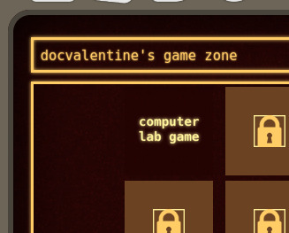
1: The background isn't black.
In real life, CRTs actually do have great contrast and produce deep blacks, but there is also a lot of ambient glare compared to most flatscreens so in an environment like a computer lab it never felt like the black was all the way dark. The vignette effect feels more true, to me. 2: Halation.
Everything is using box-shadow with a light color to evoke the halation of one of these displays.

(this is of course referring to my computer lab game available now for free in the browser you're looking at right now)
10 notes
·
View notes
Text
@snowflakechallenge 3:
Create a wish list of fandom things (podfic, graphics, playlists, canon recs translations, research help, vids, sky's the limit!) that you'd like to receive. Post your answer to today’s challenge in your own space and leave a comment in this Snowflake Challenge Dreamwidth post saying you did it. Include a link to your post if you feel comfortable doing so.
I'm mostly blanking on things I want that aren't on my fandomtrees wishlist (which has Emelan, Encanto, Miraculous Ladybug, and Yuri on Ice prompts) or holiday_wishes wishlist (though the only fannish bits there that aren't on the fandomtrees list are in the spending-money section).
But! The first chapter of starting right now I'll be strong and all chapters of Jeu des princesses avec les pommes d'or de la discorde, inscribed 'to the fairest', both canon-divergent Yuri on Ice fics, are told entirely through stuff the characters said on the internet. Notably on Instagram. Thing is I do not have either the art skills or the art commission money to illustrate most of those Instagram posts. So if I can't glue the Insta post together using canon screenshots, Wikimedia Commons, and Unsplash, then the Insta post has to stay text-only. (You can see in the second chapter of Jeu des princesses how well that's going. I do have two and a half of the images for the first chapter of starting right now—the first one, the Minami one, and the top half of the one where the bottom half is Yuuri stole Phichit's Pikachu hat—but comparing those two chapters may illustrate why I haven't added those images yet.)
So in addition to what's listed on fandomtrees—and I'm joining the chorus of Snowflake participants who want people to look over all those wishlists, or at least the ones with fewer than two gifts, and fill what you can—I am asking for fanart that's the image part of one or another of the Insta posts in one of those two fics.
And! fandomtrees doesn't do Creator's Choice of Fandom, which is valid, but does mean I had to leave this prompt off that list:
* exploration via historical documents, primary and secondary sources, etc., of canon characters/events and their effects on the local, regional, and global courses of history. this could be set a couple hundred years after canon and thus explore canon from a historian's perspective (social media posts could be both primary and secondary sources here, depending), or it could be set around, during, or before canon and explore characters who have been name-checked at most.
Also, the how to use CSS to make iOS messages look realistic guide by CodenameCarrot and La_Temperanza makes it seem like there should be a way to use background-image in the CSS from the how to use CSS to make vintage-2016 Instagram posts look realistic guide by gadaursan (with instIcon1 instIcon2 instIcon3 instead of instIcon, as well as instIconRight instHeart) so that those five little icons don't display when creator style is off. But so far all I seem to be achieving is making them not display when creator style is on, either. Send help?
13 notes
·
View notes